ABOUT
Carla Lupresti (@corlanation) is a make-up and hair artist based in Buenos Aires. She loves fashion, art, and music; her universe is colorful, fun, and carefree.
In her works we find influences from the underground music scene of the 80s, glamorous and decadent drag queen atmospheres, and experimental contemporary looks. Beyond the visual result of her work, Corla Nation always conveys a message of gender equality, sexual freedom and authenticity.
Before designing Carla’s identity, I created a mood board called «opulent decadence» with images of drag queens, cats, kitsch environments and pastel tones.
I tried to reflect this atmosphere of decadent glam and strangeness in her logo and graphic elements, but keeping at the same time the aesthetic fancy and harmonious.
I tried to reflect this atmosphere of decadent glam and strangeness in her logo and graphic elements, but keeping at the same time the aesthetic fancy and harmonious.
I WORKED ON
+ Background research and branding questionnaire
+ Market research and benchmarking
+ Defining the brand core, storytelling, and brand archetype
+ Primary logo, secondary logo, and isotype design
+ Packaging design
+ Stationary
+ Social media templates

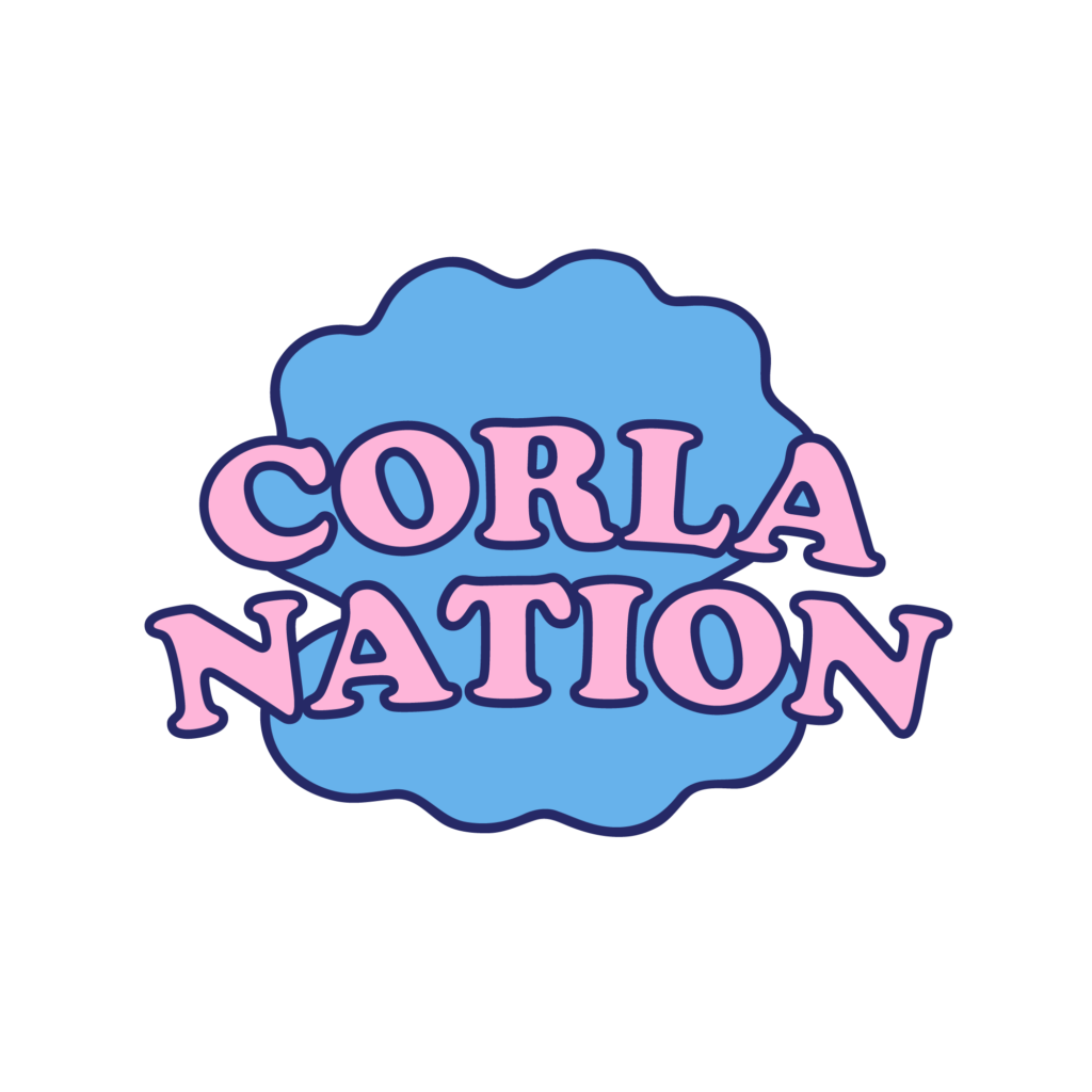
Primary logo:
Composed of two elements:
1. Graphic element
– The outline of a seashell inspired by the drag queen and disco aesthetic from the late ’70s
2. The text
– Font: cooper black. Very popular typography used during the late ’70s in album covers and animated cartoons.

Submark:
A seashell, taken from the outline of the logo, represented in its most simplified form.
A naive and tender icon, almost childish, reminiscent of the cheerful and carefree universe of «Corla Nation»


